

What are the risks versus benefits of getting the COVID-19 vaccine? By now, you likely have made your own personal risk assessment and decision. I am not trying to change your mind. Like you, I have had to make my own decision. In a sense, the whole world is undertaking a massive risk management exercise. What I found helpful is the approach offered by the Cambridge Winton Centre for Risk and Evidence Communication. (From its url, I surmise that it’s connected to the Faculty of Mathematics.)
The Winton Centre’s mission statement is stated plainly on its homepage: “To inform, not persuade. To make good decisions, we all need good evidence which is clearly communicated.” Let’s see what we can learn about risk management from Cambridge mathematicians.
Risk Management Element #1: Gather Data and Establish Trust in Data
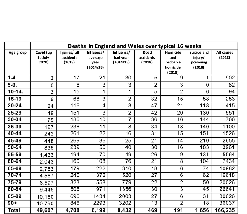
In a comparison of Covid-19 fatalities with other causes of death, the Winton Centre (WC) published its sources of data i.e. from the UK Office of National Statistics, Public Health England, and Office of National Statistics’ Nomis system. So the first element in risk management is to gather the data and establish trust in that data.
Risk Management Element #2: Personalize the Risk by Segmenting Data by User Groups
It then personalizes the risk by breaking it down into segments that users can identify more closely with. It’s one thing to state average numbers of fatalities. It’s another to highlight fatalities for your specific age group.
In terms of project management, one way to think of this is by asking, “Who are the stakeholders for this risk? What data do they care about?” Then we can go about refining the data, filter away the noise, and tune into a stronger signal.
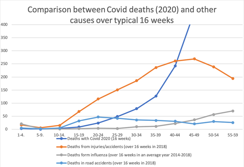
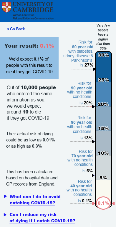
Risk Management Element #3: Visualize the Risk and Benefits
The WC has a few charts and visualizations to personalize the risk. Most of us a visual learners and so images speak louder than words and numbers. This chart uses the vertical dimension of height to indicate higher versus lower risk.
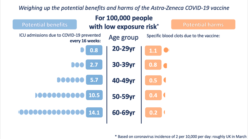
The following diagram uses size (space occupied by number of dots) and colour to compare risk and benefits.
Risk Management Element #4: Localize Your Data and Observations
Gather your own data from your own sources and compare it to the published data. Both UK and Norway were using the AstraZeneca vaccine. Norway used it’s own data to assess potential benefits and the Norwegian Institute of Public Health reached a different decision than UK. While the British public received the AstraZeneca vaccine, Norway removed it from its vaccination programme.
Conclusion
These risk management steps are not complex. However if done well, they can be very helpful when it comes to realizing risk management benefits through clear and simple communications which in turn help stakeholders make their own risk assessments and responses. In fact, risk management could well be another important project management skill for the future.
Sources
- https://wintoncentre.maths.cam.ac.uk/
- https://wintoncentre.maths.cam.ac.uk/coronavirus/how-have-covid-19-fatalities-compared-other-causes-death/
- https://wintoncentre.maths.cam.ac.uk/coronavirus/communicating-personal-risk-covid-19-advice-our-studies/
- https://wintoncentre.maths.cam.ac.uk/news/communicating-potential-benefits-and-harms-astra-zeneca-covid-19-vaccine/
- https://www.msn.com/en-my/news/national/norway-warns-of-covid-19-vaccine-risk-after-23-die/ar-BB1cNzKM
- https://www.fhi.no/en/news/2021/astrazeneca-vaccine-removed-from-coronavirus-immunisation-programme-in-norw